Viz-a-day
Some plots are trickier than they look. In order to hone my dataviz skills in matplotlib, I’ve been replicating interesting charts I see in the news. I’ve been noticing more horizontal stacked bar charts in articles on news sites. I’m guessing the horizontal construction plays better with smaller screens and, if the chart is presenting minimal information, like the answer to a survey question, it breaks up or grounds the columnar format nicely. Here’s an example from a recent publication from the Kaiser Family Foundation.
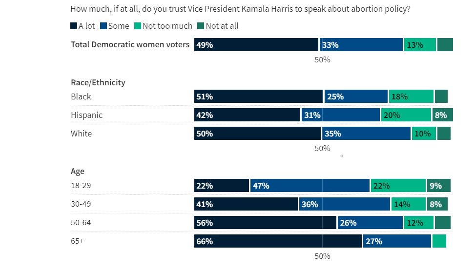
Unfortunately, matplotlib doesn’t seem play nicely with legend labeling. I spent several hours trying to tweak different forms of this chart using different tutorials. My first attempt was the following:
import matplotlib.pyplot as plt
import numpy as np

category_names = ['A lot', 'Some',
                  'Not too much', 'Not at all']
category_colors = [ '#001e36','#004a87', '#00b588', '#1a7563']
results = {
    'Total Democratic women voters': [49, 33, 13, 5],
    '18-29': [27, 47, 22, 4],
    '30-49': [41, 36, 14, 9],
    '50-64': [56, 26, 12, 6],
    '65+': [66, 27, 7, 0]

}


def survey(results, category_names):
    """
    Parameters
    ----------
    results : dict
        A mapping from question labels to a list of answers per category.
        It is assumed all lists contain the same number of entries and that
        it matches the length of *category_names*.
    category_names : list of str
        The category labels.
    """
    labels = list(results.keys())

    data = np.array(list(results.values()))
    data_cum = data.cumsum(axis=1)
#     category_colors = plt.colormaps['RdYlGn'](
#         np.linspace(0.15, 0.85, data.shape[1]))

    fig, ax = plt.subplots(figsize=(9.2, 5))
    ax.invert_yaxis()
    ax.xaxis.set_visible(False)
    ax.set_xlim(0, np.sum(data, axis=1).max())

    for i, (colname, color) in enumerate(zip(category_names, category_colors)):
        widths = data[:, i]
        starts = data_cum[:, i] - widths
        rects = ax.barh(labels, widths, left=starts, height=0.5,
                        label=colname, color=color)


        text_color = 'white'
        ax.bar_label(rects, label_type='center', fmt = "%.0f%%", padding=-8, weight='bold', color=text_color)
    ax.legend(ncols=len(category_names), bbox_to_anchor=(-.29, 1), loc='lower left', fontsize='small')
    ax.text(x=-.09, y=1, s="How much, if at all, do you trust Vice President Kamala Harris to speak about abortion policy?", transform=fig.transFigure, ha='left', fontsize=13, alpha=.8)


survey(results, category_names)
plt.show()
Which yielded this.
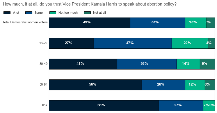
Next, I tried
import pandas as pd

# dataframe
df = pd.DataFrame({'A lot': [49,27,41,56,66],
                   'Some': [33,47,36,26,27],
                   'Not too much': [13,22,14,12,7],
                   'Not at all': [5,9,8,6,0]},
                   index=['Total Democratic Women Voters', '18-29', '30-49', '50-64', '65+'])

# get the totals for each row
totals = df.sum(axis=1)

# calculate the percent for each row
percent = df.div(totals, axis=0).mul(100).round(2)

# create the plot
ax = percent.plot(kind='barh', stacked=True, figsize=(9, 5), color=['#001e36','#004a87', '#00b588', '#1a7563'], xticks=[])
# move the legend
ax.legend(loc='upper left', ncol=4, frameon=False, bbox_to_anchor=(-.5, 1.1))

# remove ticks
ax.tick_params(left=False, bottom=True)
# remove all spines
ax.spines[['top', 'bottom', 'left', 'right']].set_visible(False)

# iterate through each container
for c in ax.containers:

    # custom label calculates percent and add an empty string so 0 value bars don't have a number
    labels = [f'{w:0.0f}%' if (w := v.get_width()) > 0 else '' for v in c]

    # add annotations
    ax.bar_label(c, labels=labels, weight='bold', label_type='center', padding=1, color='w')
This improved the labels on the bar, but didn’t help with the y-axis labels or legend mat size.
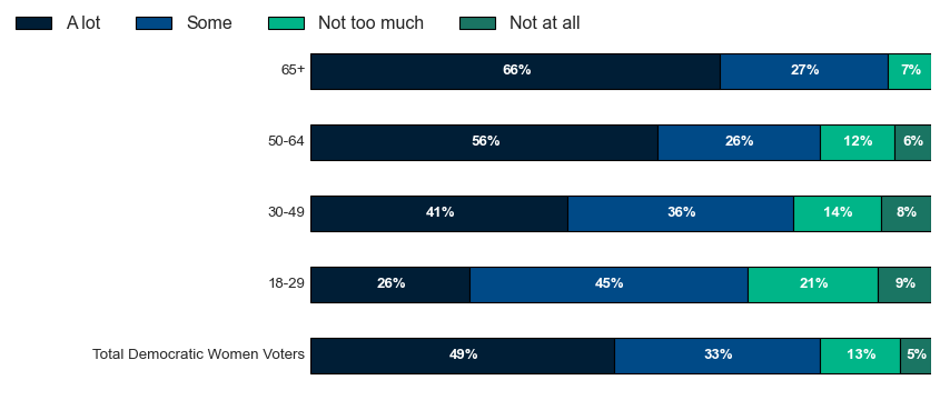
In my final matplotlib attempt, I tried to tweak the rc_params.
import pandas as pd
import matplotlib.pyplot as plt

category_names = ['A lot', 'Some','Not too much', 'Not at all']
results = {'65+': [66, 27, 7, 0],
           '50-64': [56, 26, 12, 6],
           '30-49': [41, 36, 14, 9],
           '18-29': [27, 47, 22, 4],
           'White': [50,35,10,5],
           'Hispanic': [42,31,20,7],
           'Black': [51,25,18,6],
           'Total Democratic Women Voters': [49, 33, 13, 5]}

# setup dataframe using the dict provided in the OP
df = pd.DataFrame(results, index=category_names)
# transpose df from the OP so Party is the in the columns and Ward is the index
dft = df.T
# plot
ax = df.T.plot.barh(stacked=True, figsize=(10, 6), color=['#001e36','#004a87', '#00b588', '#1a7563'])

ax.legend(loc=(-.365,1.03), ncol=4, frameon=False, markerscale=12)
SMALL_SIZE = 8
MEDIUM_SIZE = 10
BIGGER_SIZE = 12

plt.rc('font', size=BIGGER_SIZE)          # controls default text sizes
plt.rc('axes', titlesize=SMALL_SIZE)     # fontsize of the axes title
plt.rc('axes', labelsize=MEDIUM_SIZE)    # fontsize of the x and y labels
plt.rc('xtick', labelsize=SMALL_SIZE)    # fontsize of the tick labels
plt.rc('ytick', labelsize=MEDIUM_SIZE)    # fontsize of the tick labels
plt.rc('legend', fontsize=BIGGER_SIZE)    # legend fontsize
plt.rc('figure', titlesize=BIGGER_SIZE)  # fontsize of the figure title
plt.rcParams['xtick.top'] = plt.rcParams['xtick.labeltop'] = False
ax.set_yticklabels(results.keys(), ha = 'left')              # Set horizontal alignment to left
ax.yaxis.set_tick_params(pad=200,            # Pad tick labels so they don't go over y-axis
                         labelsize=11,       # Set label size
                         bottom=False, top=False)       # Set no ticks on bottom/left

# annotations:
for c in ax.containers:

    # format the number of decimal places and replace 0 with an empty string
    labels = [f'{w:.0f}%' if (w := v.get_width()) > 0 else '' for v in c ]

    ax.bar_label(c, labels=labels,label_type='center', color='w', weight='bold')
Which put the y-axis labels where I wanted, but I still couldn’t figure out the mat changes.
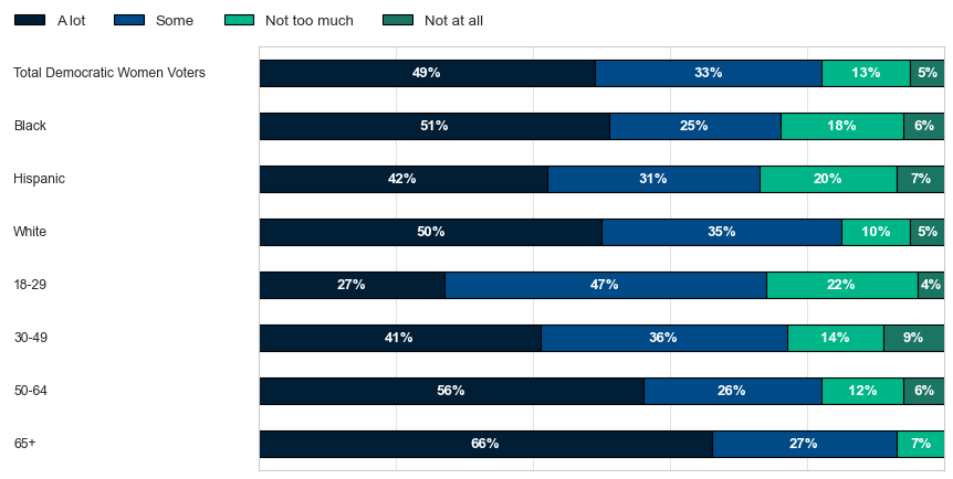
I finally gave up and tried using Flourish, a dataviz product. I wasn’t familiar with it, but going down the rabbit hole looking for solutions, I found it recommended by an Al-Jazeera datalab journalist. Here’s the product.
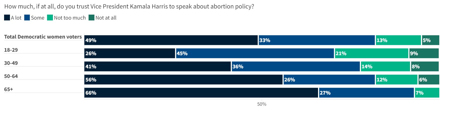
Later, I’ll see if I can learn more fixing those legend values.